Use Associations and Bigrams to Understand Text Comments
We continue here to discuss NLP techniques for extracting meaning from free-form text comments. The first post in the series is here while the second post is here.
Calculate Word Associations
Correlation is a statistical technique that can tell how strongly distributions of number resemble each other. For example, the correlation between the number of lawyers in a firm and the average hourly billing rate is strong; as one rises, the other tends to rise. Correlation underlies an NLP technique that takes a document-term matrix and calculates for any terms you give it other terms whose correlations with it satisfying the lower limit you set.
It helps the analyst grasp context around the word pairs. For example, if “pressure” were a frequent term in comments on an associate engagement survey, and it was highly correlated with “vacation” (such as higher than 0.7) that gives a clue about how to understand the close relationship between the two words when they appear in the comments (as compared to, say, “workload” if its correlation were 0.3).
The plot below shows the correlations of word associations in the blog posts described above. The thickness of each edge indicates its correlation from the legend (such as the dark edge between “document” and “frequency” in the lower right cluster). The color of the node corresponds to the frequency of the term (“survey” is the lightest blue). This sample set lacks the density – sheer volume of words – so it does not convey much.

Plot a Network of Bigrams
For text comments, software can say how often a word precedes another word – called a bigram. The sentence “All’s well with timekeeping” contain three bigrams: “All’s well,” “well with,” and “with timekeeping.” Software can depict the network of common bigrams, where each word in a bigram is a node (also called a “vertex”) with an edge (“link”) that connects the node to other nodes, e.g., “choice” links to “multiple” and “multiples. With more text, a bigram network yields more insights.
A common layout for such graphs (the Fruchterman-Reingold algorithm) encourages closely related nodes (words) to appear near each other on the plot. The effect of this is that the best-connected nodes gravitate to the center of the graph, and the least-connected to the edges. The bigram network graph shown below comes from my posts on this blog, Savvy Surveys for Lawyers.
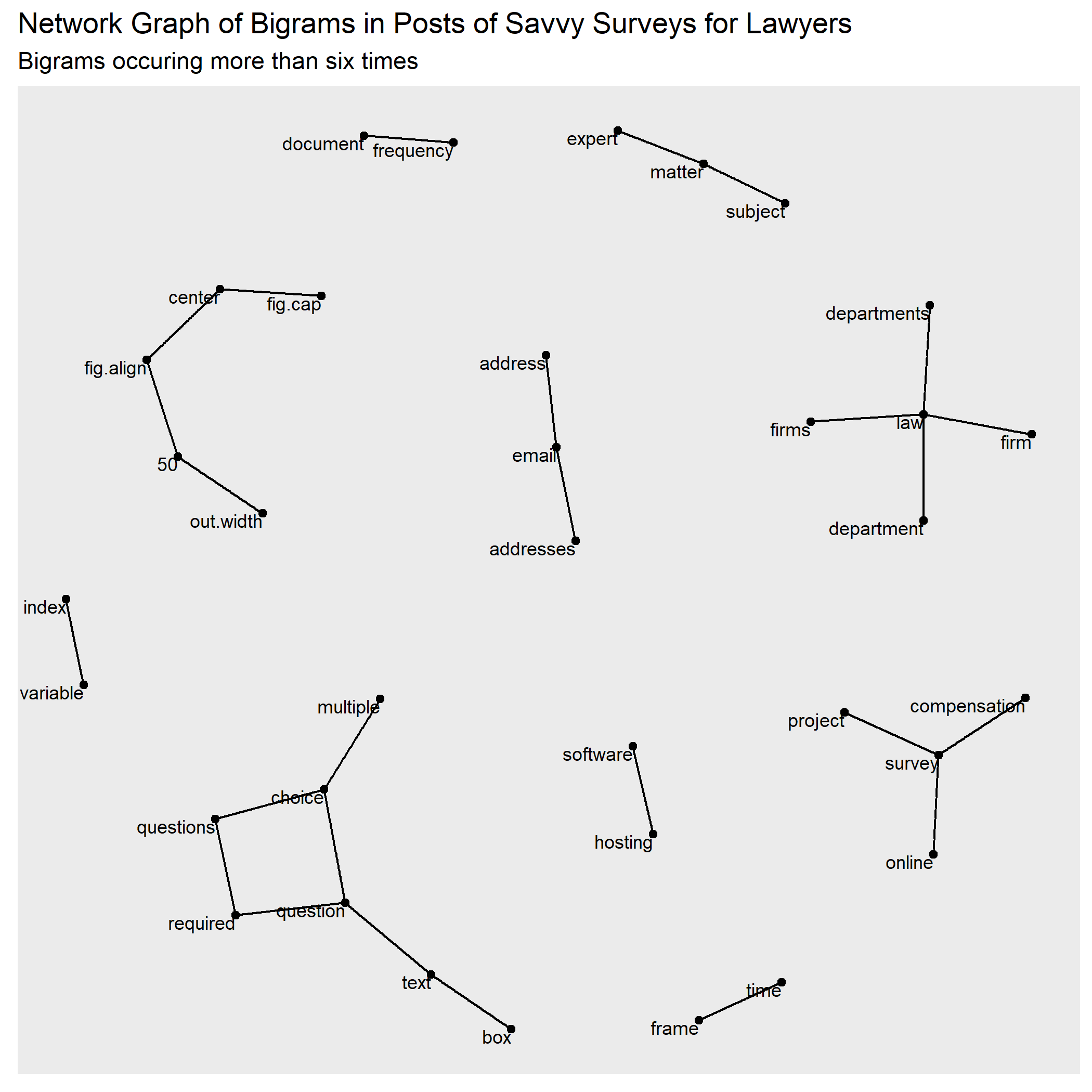
The nodes and edges of a network graph may be sized or shaded much like a word cloud’s parameters. In that way, frequent bigrams may be plotted larger than less frequent ones. The co-occurrence frequency of any two words can be visualized by edges whose thickness depends on their frequency.
The tools described in the preceding post and above introduce four NLP interpretations of comments. From a mass of free-form text written in response to a survey question, these tools can depict common significant words, quantify relationships between words, classify mood, and help us consider words that often pair together. In combination, they enable better and quicker understanding of respondents’ views as expressed in their free-form writing.