Choose Among Text, Lists, Tables, Charts and Infographics
When you present survey data, you can choose among five primary modes: text, lists, tables, charts, or infographics. Each serves a different purpose and demands different skills from those who use them. Each mode has its strengths and weaknesses. Let’s consider them in order of their difficulty to implement.
Text has the obvious advantages of being easy to produce and readily understood. With word-processing, you can apply bold, underline, italics and size to emphasize different numbers, but mostly it is a strung-along verbal description of numbers. Here is a tiny example of data presented as text:
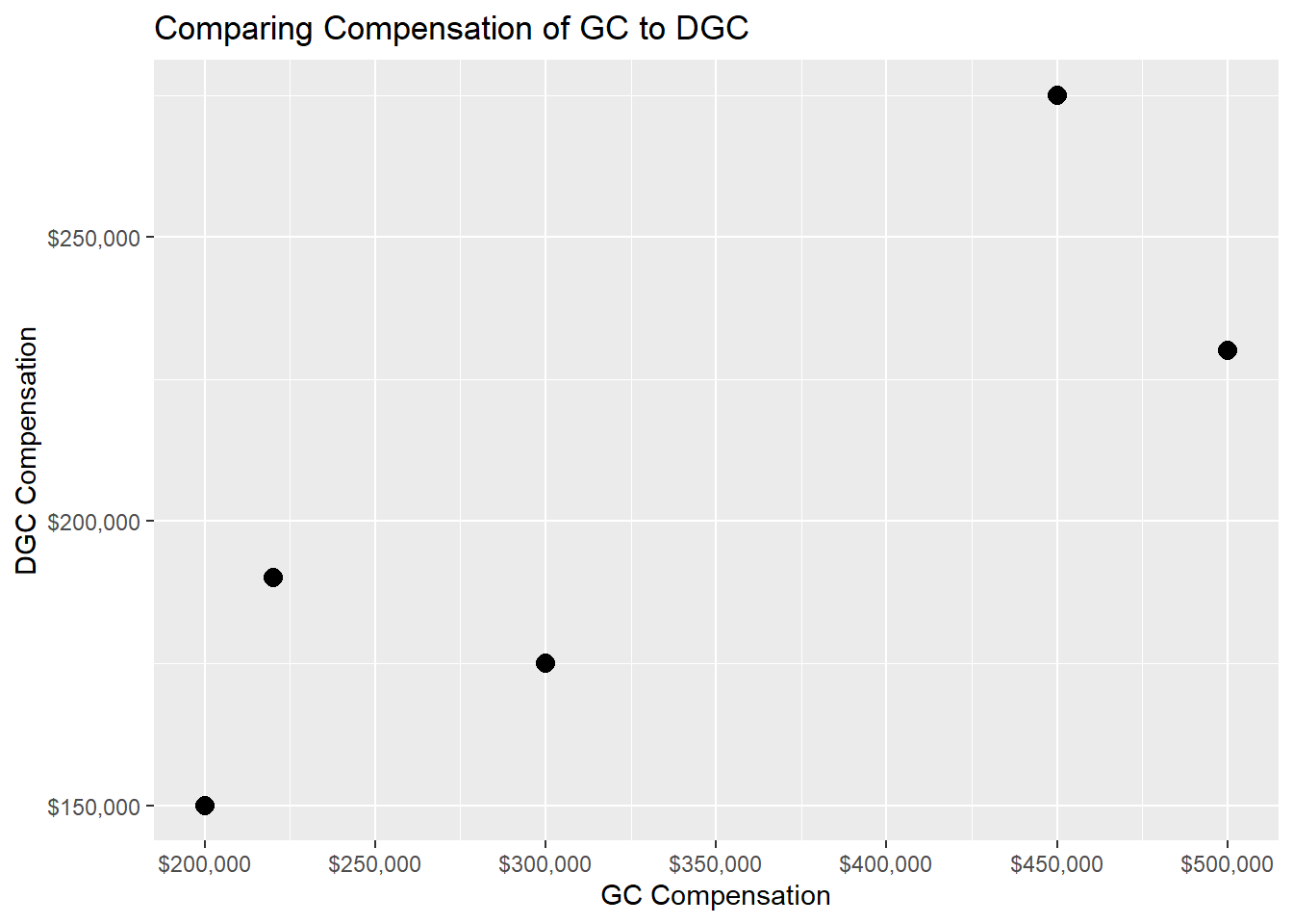
“The six general counsel received base compensation of $200,000; $300,000; $500,000; $220,000; and $450,000. Their deputy general counsel made $150,000; $175,000, $230,000, $190,000, and $275,000.”
As you may have just experienced, among the drawbacks of text is that it takes a long time to wade through the numbers and a reader is quickly bored or exhausted if the data is of even moderate size (imagine slogging through data on 100+ general counsel and their deputy general counsel). Then too, you must to read from left to right, unlike tables and plots where the eye can settle on any part and move anywhere. Text is rigid. Note also that the reader can for the most part only glean what the writer includes. Trends and anomalies prove difficult to ferret out.
Lists create a visual order to numbers that are still presented as text. Most people can absorb the data a bit better from a list than from sentence and keep the numbers in mind and even draw some conclusions about them. At least lists align numbers, which make them easier to absorb than left-to-right text. Here is the same data for general counsel in a list,
- GC $200,000
- GC $300,000
- GC $500,000
- GC $220,000
- GC $450,000.
Lists are not as easy to create with word-processing software as plain text, but almost. A list takes up more space than text and it requires a little bit of facility with word-processing techniques. That you can choose different bullets hardly makes a list into a graphic!
Tables go farther than lists to structure data and can include multiple columns, whereas a text list usually does not. Options with a table include to shade certain cells or put labels on top of columns. It is also straightforward to add more columns, such as in the table below to add the practice of the lawyer or the lawyer’s office location. Tables can also readily include totals of columns or rows and perhaps automatically update them. Finally, you can copy data from a spreadsheet and create a table in a text document (or paste the spreadsheet selection directly). Take a look at the table below and compare it to the preceding versions of text and list.
It is appropriate to use tables when you need to display specific values with their exact representation; you need to show many numerical values in a relatively small area; you want to compare or contrast several numerical values; and you want to compare or contrast values between related items.
GC $200,000 DGC $150,000 GC $300,000 DGC $175,000 GC $500,000 DGC $230,000 GC $220,000 DGC $190,000 GC $450,000 DGC $275,000
When you include numerical values in tables always align them to the right to allow comparison of their magnitudes. If you align to the center or the left, the visual effort becomes a strain. If you use decimals, equalize the number of decimals and place them to the right; always use the appropriate and significant number of decimals.
The table puts a little more strain on the reader to make sense out of the data that it presents. Tables make it hard for some readers to interpret the data beyond simply recording it. They are generally densely-structured and can be boring.
Charts can present all the data so that someone can conclude what they derive from it on their own as compared to relying on what a writer offers them. Scatter plots excel in showing all the data. In other words, a chart can be visually rich with data right down to a point for each datum. Charts introduce possibilities to choose from a plethora of plot types, use icons, choose colors and shapes, add annotations, show median or trend lines, overlay confidence intervals or error bars – a huge array of visualization tools. A world of charting software is available. People use Excel quite often, but other choices include Mathematica, OriginLab, Matlab, Python, the R programming language, SPSS, SAS, Tableau, PowerPoint, and others. The plot below shows the same data as the text, list, and table above; take into account that it is as simple as a bar plot can be and lacks all the embellishments that when used adeptly can dazzle and amaze.
On the other hand, charts can be misunderstood by those who are not familiar with them and to do a good job the graph creator should use software other than word processing to prepare the graphs. As a note, we should not forget the wide range of graphical powers, and the limitations, of the ubiquitous PowerPoint.
Infographics take another step of sophistication. They extract what is important from a data set and put it in context while also being enticing to look at and learn from. Infographics aggregate data and present a story where words and numbers are combined along with visual effects such as icons, size, or color. To produce infographics, a variety of software packages are available. Infographics can be much more creative and free-form than the other modes of data presentation.
For example, an infographic might put bags of money in proportion to the differential between General Counsel compensation and deputy general counsel compensation and then have text woven around it that explains the reasons for the gap or changes over time. As compared to the other four methods described above, however, infographics demand special software and a designer’s sensibility. Infographics go beyond simply regurgitating numbers; done well, they require experience, imagination, and capable software tools.
So, a picture (graph) is worth a thousand words, and an infographic even more, but words, lists, and tables play their roles when you offer data to the legal industry.