Make Sure Graphics Can be Readily Understood
My enthusiasm for vivid graphics that convey a survey’s finding knows no bounds. If the reader’s eye immediately grasps the take-away of an attractive plot, the sponsor has done well. If, on the other hand, a plot causes confusion, delay, and page turning, that effort has come to naught.
With that ideology made clear, let’s critique the plot below, which comes from the 2023 Annual Litigation Trends Survey Report by Norton Rose Fulbright (pg. 15). You are encouraged to study the entire excellent report, which is available for download at (https://www.nortonrosefulbright.com/en-us/knowledge/publications/52bd21a0/2023-annual-litigation-trends-survey).
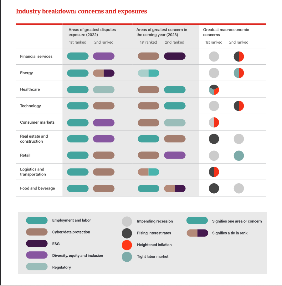
The plot is gorged with so much information that it overwhelms all but the most patient and committed interpreter. It takes concentration to parse it and I couldn’t spot an explication in the text. Accordingly, it contributes little to the overall endeavor of the survey – to collect, distill, and interpret litigation data.
Here is my unpacking. For each of nine industries down the upper left side, the plot conveys how respondents from them ranked five areas of disputes. You have to scan the lower left of the legend to match the colors of the lozenges to the dispute areas. By “legend” I mean the shaded area at the bottom. In 2022, the dispute area ranked by all the industries as creating the greatest exposure was “Employment and labor.” That’s the column of green under “1st ranked.” Under “2nd ranked” are “Diversity, equity and inclusion” and “Cyber/data protection,” except among Energy respondents, “Cyber” was tied with “ESG” according to the split color (“signifies a tie in ranking”, below right).
Moving to the third and fourth columns, the areas of greatest concern for 2023 are “Cyber” and “Employment”, but two industries have split-color lozenges, indicating a tie between “Regulatory” and “Employment” for Energy companies and a tie between “Cyber” and “Employment” for Logistics and transportation companies. Once you grasp what the tie lozenges indicate, you realize why the “2nd ranked” column of that block for the two ties has no dispute area.
The right side of the plot, columns 5 and 6, report findings of “Greatest macroeconomic concerns,” it is even harder to digest. Single-color circles correspond to the top or second rank of the four concerns shown in the legend’s middle column. The reader is left to figure out that ties are indicated by split pies, and that Healthcare respondents produced a three-way tie. Thus, for example, the Consumer markets respondents divided evenly in their macroeconomic concerns between “Impending recession” and “Heightened inflation.”
If a report includes a graphic of such informational density, it ought to add a text explanation: “how to make sense out of this graphic.” As part of that explanation, it should give an example of how to fathom any specific part of the plot, as I have done in the preceding paragraphs. Second, it is unclear why the dispute findings are linked with macroeconomic findings. The connection needs explication. Third, I would place the four macroeconomic areas under the right side, instead of in the middle of the legend, and add a counterpart of the two-part lozenges with two-part pies, so readers can more quickly makes sense of the graphic. Also, the background color of the legend should correspond to the background of the upper part.
To be clear, I like the technique of displaying ties in ranks by lozenges or pies of one, two or three colors. But tell us how to figure them out! It may be churlish to criticize this plot for its opacity when it is carrying such a load of information, but quantity does not atone for quality.