Encourage Respondents to Finish the Survey
People who have been invited to take a survey and are debating whether to start it would prefer to know how many questions they face, how long it will likely take for them to complete the questions, what percentage are required (xref), whether they will need to do research, whether they are qualified(xref), or all these facts. I urge sponsors to cover these reasonable inquiries in the invitation email.(xref) Knowing the parameters of the survey ahead of time, a respondent who starts is more likely to keep going to the finish.
Disagreeing with such openness, survey sponsors might want to avoid disclosing, for example, the number of questions, because saying, “only 24 questions” might deter potential takers who interpret that as an imposing task. Sponsors know that not all questions make equal demands on the respondent: “Last name” is a crack in the road, whereas “Please rank the following 16 issues” is a steep speed bump. But that fineness of description exposes too much detail to share. Perhaps you could write “Six questions ask for demographic data, five explore office configurations, five technology support, and six training. You only must answer three basic questions at the beginning.”
What I have never seen is a reveal of all the questions at the start (perhaps courtesy of a blog post and a link to the post), or a flow chart of questions and related questions clumped by topic. And I would be wary of letting respondents pass over questions because they tell themselves that they will return to them. They probably won’t, unless at the end a message reminds them, “You left questions 5 and 16 blank. Would you like to return to them?” Such a message would be the height of sophistication for the hosting software.
I favor disclosure of the demands a survey makes on someone, but perhaps my view – steeped in open-source ideology – falters in the real world of busy people who will seize on any reason to put off doing the survey. “Twelve minutes?” File and forget…
A survey designer can take an additional step and explain that they have included on the questionnaire a rolling indicator of what percent has been completed. The image below shows in the upper right an example of a completion percentage bar that fills in from left to right as the respondent moves through the survey. It also gives the percentage figure (20%).
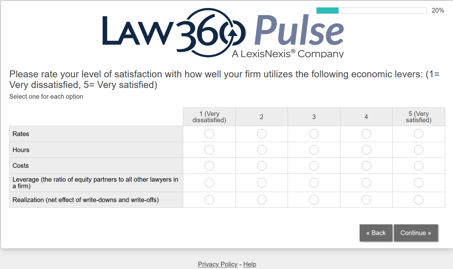
Curiously, you don’t from know whether the expanding bar represents the percentage of questions completed, of survey pages completed, of the estimated time to finish, or of another metric. It could even be inexact, impressionistic, more of a “you are making progress” reassurances to coax the laboring respondent than a calculated milestone. The hosting software may explain the basis for its presentation.
At times you see a message at the end of the page to the effect of “Page 3 of 8.” That statement lets you know where you are in the questionnaire, but it doesn’t help you know how much longer you might have to spend filling in answers. But that criticism applies equally to the filled-in bar of the image above.
Another technique that encourages continuation is a “resume later” button on each survey page. With that option, a person can move through the survey as far as they have time or inclination, click the button, and return to finish the questionnaire later.
If you explain in a text area that “The next five questions ask about your views on food in the cafeteria,” those traffic signs at least somewhat help respondents understand the path ahead and keep up their enthusiasm. Even more so, If a person can scroll to the bottom of the survey, they can draw their own conclusions about the surveys demands.
Having a manageable array of questions helps reduce attrition. Mostly, a timely topic explored by thoughtful, well-written and on-point questions – god forbid, no marketing – will draw respondents along through the final question.