Make No Mistakes about Error Messages
Error messages alerted by the hosting software after being triggered by a mistake or an omission on a questionnaire hark back to the jarring reminders that programmers confront. They tend to be blunt, cryptic, and annoying. You usually can’t move on through the survey until you unravel the knot. Even worse, if the designer of the question has set validation tests, a frustrated respondent, or one who legitimately does not want to be coerced, may find it hard to create a fake answer.
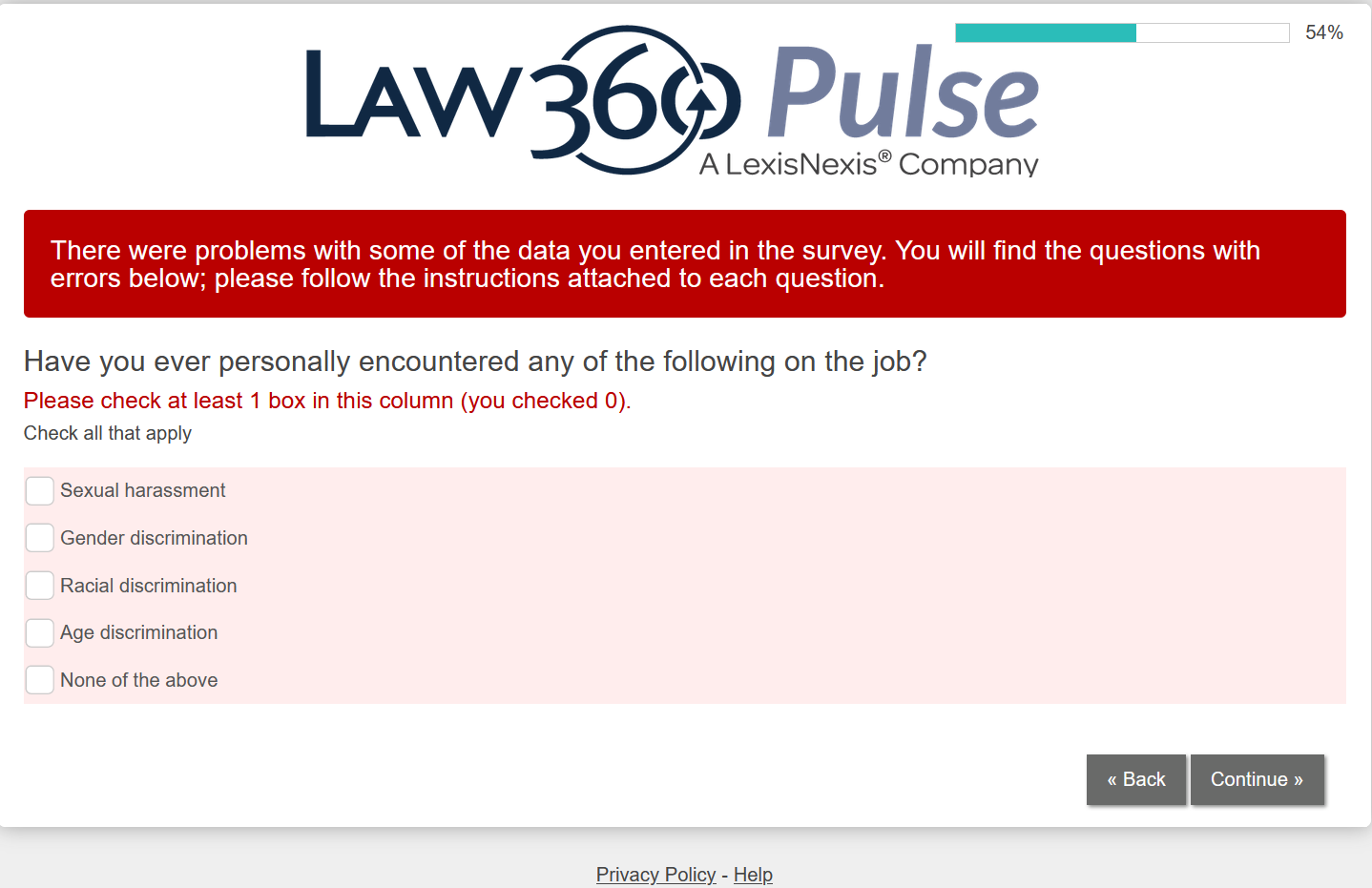
Here is an example of an error message that confronted me as I explored a recent Law360 Pulse survey.

What struck me was that at least a dozen questions preceded this one, but they were not tagged as required. Yet here is a controversial piece of information that the sponsors insist o and that has no time limit backwards.
OK, you know you blew it and why you blew it, but the in-your-face error message has a brutality that is off-putting. As a sponsor of a survey, you want to coddle respondents, not cudgel them. Perhaps I am being snow flakey and I certainly know that users of software to design surveys have little or no control over the style of displaying errors or the warnings they give. You can’t customize to that level of granularity.
Degree that you write clear questions and envelope them with equally clear instructions for how to answer them, error messages will rarely crop up. More supportively, the online survey could take the hand of the person answering the question and guide them in a friendly way to the proper format or whatever is necessary. I can imagine guides telling respondents how to interpret an error message and how to remedy the mistake.
Stress tests(xref) should uncover the range of error messages and how they appear. Not only should the person who puts the draft survey through its paces try to trick it and create edge cases, but they should take note of how the software responds to mistakes.
While on the topic of error messages, I should point out that hosting software also generates error messages for the designer of a questionnaire. For example, with NoviSurvey.net if you over-look that a multiple-choice selection is missing a description, the software points it out.
In a kinder and gentler world, the error messages would be, well, kinder and gentler, and perhaps the fonts and color schemes would suggest less of a five-alarm fire.