Do Any Days of Reported Russian Losses in Ukraine Stand Out as Anomalous?
Before relying on a regression model, it is sound practice to comb the data to detect unusual days of figures. Spotting and evaluating whether to retain abnormal data helps make sure that the loss figures are neither mistakes in measurement, collection, data entry, or calculation nor are they unjustifiably warping the regression model. A potential outlier would be a day where, according to the regression model, equipment losses very poorly predict the Soldier value (number of military casualties).
We can’t peer inside to see how the Ukrainian military produces the loss figures, but we can probe their figures for three varieties of unusual data: outlier days, leverage days, and influence days. Let’s delay an explanation of those statistical terms and get right to the days that various methods alert us to as questionable. From the statistical tests and plots explained in “Under the Hood,” the table presents problematic days and their key equipment losses. The two days in red I decided are outliers which should be dropped from regression models.
| Tanks | APCs | AA | Arty | MLRS | Fuel | SpecEquip | UAV | Soldiers | Date | Day |
|---|---|---|---|---|---|---|---|---|---|---|
| 9 | 3 | 1 | 19 | 0 | 8 | 3 | 27 | 1140 | 2023-02-11 | 42 |
| 3 | 2 | 0 | 12 | 2 | 14 | 1 | 2 | 810 | 2023-01-05 | 5 |
| 4 | 14 | 1 | 29 | 2 | 47 | 6 | 37 | 460 | 2023-09-04 | 247 |
| 34 | 91 | 1 | 18 | 1 | 20 | 4 | 19 | 820 | 2023-10-11 | 284 |
| 0 | 14 | 1 | 30 | 4 | 22 | 3 | 80 | 480 | 2023-05-27 | 147 |
| 2 | 9 | 0 | 20 | 1 | 14 | 2 | 8 | 720 | 2023-05-22 | 142 |
| 6 | 3 | 1 | 7 | 0 | 12 | 2 | 17 | 450 | 2023-10-10 | 283 |
| 6 | 8 | 0 | 40 | 4 | 20 | 1 | 8 | 480 | 2023-09-22 | 265 |
What stands out is that two suspect days have modest losses of Tanks and APCs, yet staggering numbers of casualties. Day 42 (Feb. 11) is so extreme that I dropped it from the data set for the linear regression that was discussed above. For that day, Ukraine reported 1,140 Russian deaths, but only a total of a dozen Tanks and APCs. Likewise, Day 5 (Jan. 5) has a similar imbalance (only five total Tanks and APCs for 810 deaths), but I left it in the data set because the discrepancy is not so extreme.
Day 284 (Oct. 11) stands out for the reverse pattern: staggering losses of both Tanks and APCs, but “only” 820 dead. The 91 APCs reported to have been demolished that day towers so high over other APCs loss figures that I suspect it is either a typo or a reversal of 19 (the next highest day reported 49 APC losses). Or it might be that the previous day, with only three APCs reported destroyed, under-stated the true number and the remainder were put into Day 284. Furthermore, Tanks on Day 284 were sky high at 34. So I also dropped Day 284 from the regression data set.
Day 247 (Sept. 4) stands our for its high number of vehicle and fuel tank losses as well as drones (UAV). The highest day reported 59 Fuel losses; the peak for UAVs was 80, so 37 is getting up there. Perhaps the combination of big losses for those two types of equipment resulted in that day being called out as a possible anomaly. Even so, I left the day in.
Day 147 (May 27) boasts Fuel and Artillery losses that are very high (30 Fuel where the highest daily Fuel total is 59 and 22 units of Artillery compared to the highest daily total of 48), yet a modest 480 dead (the fewest day of casualties totaled 320); perhaps the fighting on the line was slow but Russian artillery batteries behind the lines were going up in smoke right and left. Still, I decided to leave the day in the data set.
Day 142 (May 22) puzzles me for why it triggers several warnings about being an anomalous day. Minimal losses of equipment, to my eye, and slightly above average losses of soldiers doesn’t amount to much. So, it remains in the data. As does Day 283 (Oct. 10), which seems unexceptional and ought to stay.
Finally, Day 265 (Sept. 22) might set off alarms because of the incredible destruction of Artillery, 40 batteries, where the highest day is 48. Unusual, but the other figures seem inconspicuous, so that day remains in the data set.
Outlier Days
In more technical terms, the residual for a potential outlier day – the difference between the predicted casualties based on the regression model and the actual casualties – is large and statistically highly unusual. Each residual is transformed into a “studentized residual” by dividing it by an estimate of the standard deviation. Days with absolute studentized residuals significantly greater than 1 or 2 (depending on the chosen threshold) are often flagged as potential outliers.
I didn’t eyeball the data for the 288 days and spot the four days discussed above. Two techniques can help spot outliers: statistical tests and plots. If an outlier day is deleted, I could rerun the test to see whether other outliers are present. It is advisable to do such iterative tests with the “Bonferroni correction,” which is an adjustment to the p-value that accounts for running multiple hypothesis tests.
We can start our detective work with some straightforward plots that show unusual days or data.
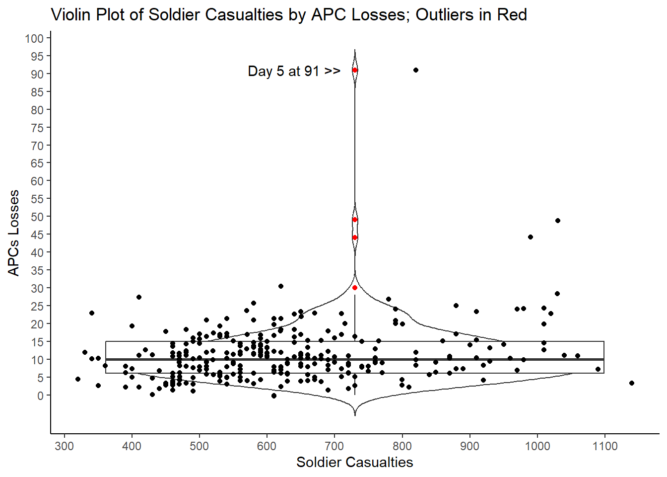
To highlight odd data, a violin plot, pardon us for saying, plays well. A violin plot combines a box plot, histogram, and scatter plot. It displays the distribution, median, and interquartile range (IQR) of data like a box plot. Moreover, it plots each point, which creates the shape of the “violin” because the width of the violin at different levels indicates how many days were at that total combination of casualties and destroyed APCs.
What we care about, however, are the outliers, the red days that are above the “whisker” rising up from the box. The whisker extends up from the third quartile figure to 1.5 times the Interquartile Range. The IQR is simply the distance between the third quartile figure and the first quartile figure. So, with APCs the IQR is 9, which is the difference between 6 and 15, the first quartile value and the third quartile value. The whisker extends up 1.5 times 9 from 15, so to 28.5. Four days reported losses above that; those days are presumptive outliers. The highest point has a red point for the APC value and a black point to its right to correspond to the 840 casualties on that day when 91 APCs were reported destroyed.
As an alternative, consider a raincloud plot, which is a hybrid plot mixing a halved violin plot, a box plot, and often scattered raw data (but which we have omitted for legibility). A raincloud plot helps visualize raw data, the distribution of the data, and key summary statistics at the same time.
The raincloud plot improves upon the traditional box plot by indicating the potential existence of different groups within the data. Unlike the box plot, which does not reveal where densities gather, the raincloud plot does precisely that!
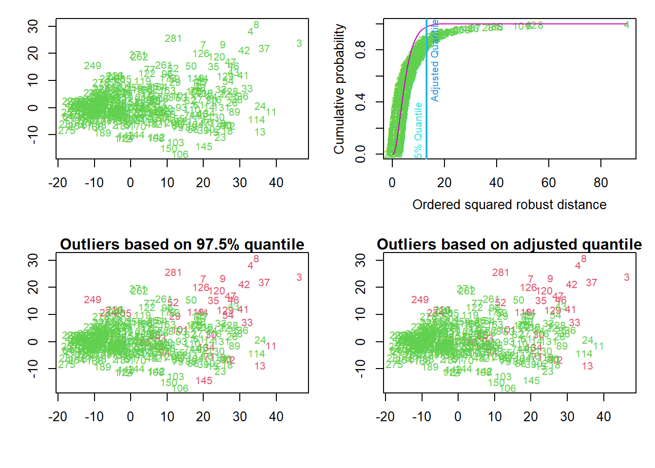
The quartet of plots below present results from looking only a data for days of Tanks, AA, APCs, Artillery, and Fuel. Because the data is more than two-dimensional, as it has five variables, the data are projected on the first two robust principal components.
The top left plot shows the days.
The top right plot shows in increasing order the squared robust “Mahalanobis distances” of the observations against the empirical distribution function of the squared Mahalanobis distance. Robust means resistant against the influence of outlying observations. The distance calculations use the Minimum Covariance Determinant (MCD) estimator. The two vertical lines correspond to the chisq-quantile specified by the analyst (default is 0.975) and the so-called adjusted quantile.
This calculation takes into account the distance of a day from the centroid of the data, and the shape of the data. The shape of multivariate data is characterized by the covariance matrix, and the “Mahalanobis distance” is a well-known measure which takes it into account. The distribution of the squared Mahalanobis distance, MD2, is chi-squared with p (the dimension of the data) degrees of freedom, i.e. χ2p. Then, the adopted rule for identifying the outliers is selecting the threshold as the 0.975 quantile of the χ2p.
To define a robust Mahalanobis distance measure RMD, software uses robust estimates of centrality and covariance matrix. The Minimum Covariance Determinant (MCD) estimator does so based on the computation of the ellipsoid with the smallest volume or with the smallest covariance determinant that would encompass at least half of the data points
For outlier detection two different methods are used. The first one marks days as outliers if they exceed a certain quantile of the chi-squared distribution. The second is an adaptive procedure searching for outliers specifically in the tails of the distribution, beginning at a certain chisq-quantile.
The bottom left plot shows the outliers detected by the specified quantile of the chi-square quantile distribution. The bottom right plot shows detected outliers by the adjusted quantile.
## Projection to the first and second robust principal components.
## Proportion of total variation (explained variance): 0.6626228
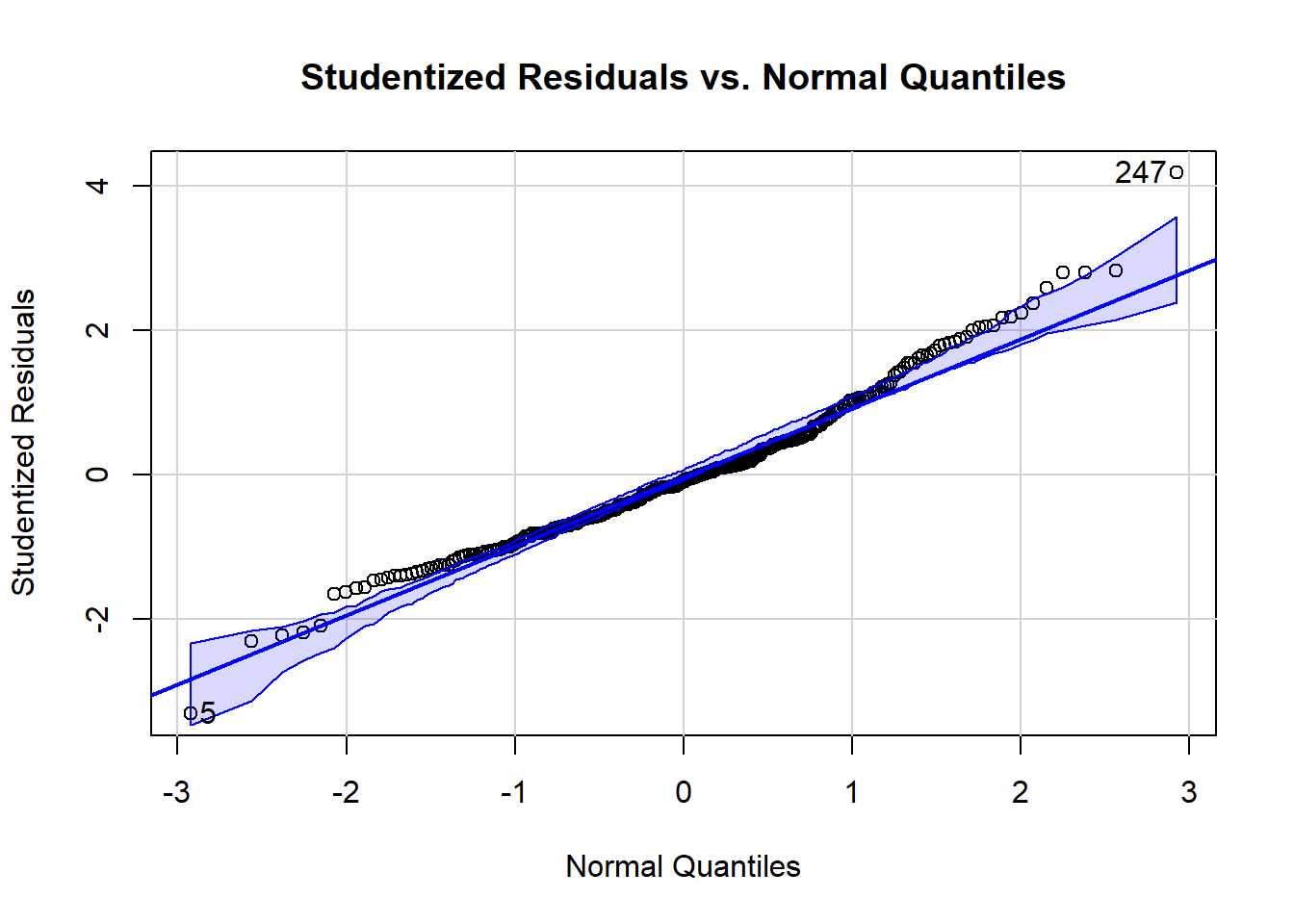
Other plots can help spot outliers. For example, the next plot shows the studentized residuals against a normal bell curve’s quantiles.^[The quantiles are what would be expected if the residuals followed a standard normal distribution (normalized as “z-scores”). The quantiles are generated from the standard normal distribution’s cumulative distribution function (CDF).] Here we see Day 247 is labeled at the top right and Day 5 is labeled at the bottom left as outliers.
The next plot comes from deleting one day at a time and creating regression models from the “left-one-out” data sets. The algorithm computes the studentized residual for the day that was left out. That means it gives the model the data of the left-out day and has the model predict Soldiers for that day; it then studentizes the difference between the prediction and the actual and plots that point on the vertical, y-axis. The horizontal red lines mark where the absolute value of the residual is two or more different than the average, which is a threshold test for outlier status. Here, too, Day 247 at the top and Day 5 on the far right (and Day 283 to its lower left) appear to be culprits. The notable losses for Day 283 in the lower right include 39 “armor” (Tanks plus APCs) and five MLRS, compared to the highest day of 9 MLRS, yet a below average 530 Soldiers.

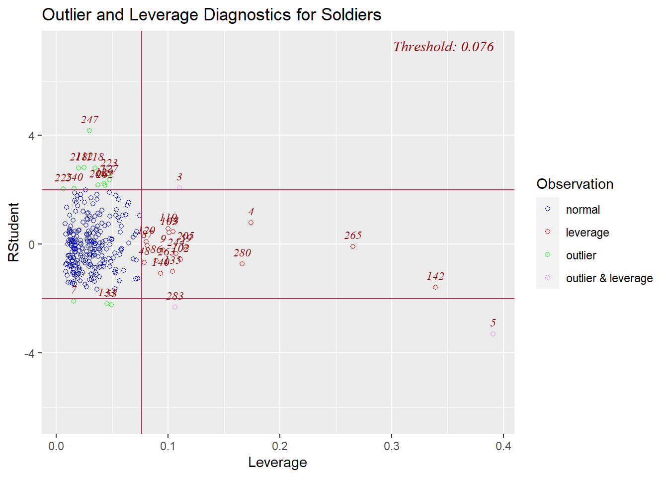
Leverage Days
Moving on from outliers, red lights also flash if the losses of a day exhibit high leverage. High leverage indicates that a day has one or more equipment losses that are far from the average of losses for that equipment. Here is a plot of the studentized residuals for days on the vertical axis and the day’s leverage value on the horizontal axis. Days outside of the “threshold” box are identified by their day number counting up from Jan. 1, 2023 (The normal days, in blue, all have a leverage value of the threshold or less.). Day 5 sits extremely low and to the right, so it is both an outlier and a high leverage day – an “influential point” – while day 247 ranges high but is merely an outlier. Days 142 (May 22) and 265 (Sept. 22) also draw attention on the far right as high leverage points.
Influence Days
The days that are not only outliers (quite large residuals) but also high leverage (far from the average values of most days) are called influential points. These days influence the regression coefficients considerably. One measure of these distorting days is called “Cook’s Distance” (Cook’s D). Cook’s D shows how much the whole regression model would change if the day were removed. The higher the Cook’s D, the more the analyst needs to scrutinize that day’s values because it exerts a noticeable pull. The computation identified large value days: 5 (0.339), 283 (0.132), 142 (0.066), 2 (0.057) and 247 (0.048) lead the Cook’s D pack.
The plot below depicts how strongly single days influence the regression coefficients. It highlights days with a large Cook’s D that also have high leverage and thus a large effect on the regression model. The plot depicts extreme days with a bubble that is proportional to its Cook’s D. Day 5 has by far the largest value and thus bubble, followed by Day 283, Day 247 and Day 142. “Hat values” are the fitted values, the predictions of Soldiers made by the model for each day. Vertical reference lines are drawn at twice and three times the average hat value, horizontal reference lines at -2, 0, and 2 on the Studentized-residual scale.

Added variable plots can also help tease out or confirm unusual days. They show the relationship between each predictor variable of Equipment and the response variable of Soldiers while controlling for the effects of the other predictor variables. That is, they show each kind of Russian equipment loss against Russian casualties. The x-axis represents what are called the “partial residuals” of the predictor variable, while the y-axis represents the partial residuals of the response variable. The line represents the fitted values from a linear regression model of the partial residuals of the response variable on the partial residuals of the predictor variable. In other words, each plot depicts a mini-regression model using one type of equipment to predict casualties.
The slope of the line in each plot reflects the partial regression coefficients from the original multiple regression model. The line-of-best-fit in the plot matches the estimated regression coefficient for that type of equipment, and the residuals match the residuals of the overall regression.
If the relationship between the equipment type and the soldier casualties is linear, the line in the plot should be approximately horizontal. If the relationship is non-linear, the line may be curved. If there is an outlier, it will be visible as a point that is far away from the other points in the plot. Both Tanks and APCs have a day on the far right that stands out.
These are actually just plots of the partial correlations of each predictor (residualized on the other predictor variables) with the target, Soldiers (residualized on the other predictor variables).
Setting aside days 247 and 223 at the top of each chart, nearly all of the identified days represent the highest loss figure for that type of equipment.
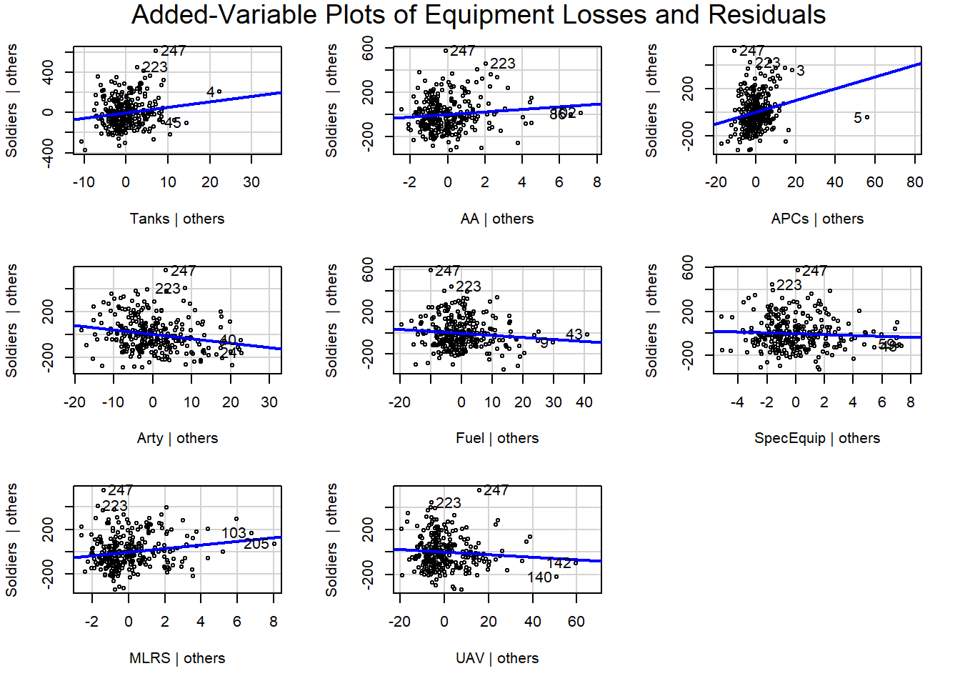
The x-axis represents the values of the particular predictor variable (the type of equipment). Each point on the x-axis corresponds to a unique value of that equipment’s loss for a day. When you look at a specific point on the x-axis, it’s as if you are considering the effect of that equipment loss on Soldiers while holding all other predictor variables in the model constant at their average values or their values specified for that particular point on the x-axis.
Thus, statistical tests and graphs point to a handful of days where the mix of equipment losses and deaths of Russian soldiers bring to our attention such extraordinary values, compared to the data of the other days, that two of them we convicted as deserving of omission from the data set.